Colour Matching – part 2 – The Apron
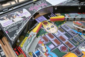
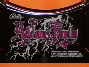
Having ruined my new apron (see post from April) I have decided to attempt to repair the screen printing which I damaged. In order to do this, I’m going to use waterslide decals, which can be printed on my inkjet printer. I’m sure that I could use an easier solution (such as the stick on decals which are available – and which I already have) but having seen such decals live, I hate the way they look. Take a look at this picture, for example:
Just look at those stick on decals and those edges – yuck!
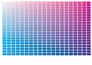
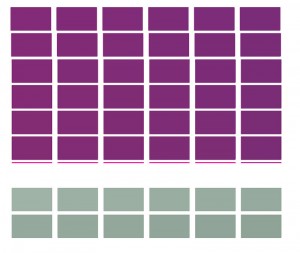
As I intend to use the waterslide decal on just the Addams Family lettering, I need to match both the purple and white colours. So back to my colour grids from last month. The first thing I noticed was that the purple colour appeared to be a mixture of just cyan and mauve. So I printed a grid of cyan versus mauve with 0% yellow:
From this, I decide that the best match was with 100% Mauve and 65% Cyan, however the colour was not quite right, so I printed a new colour grid with 100% Mauve and 65% Cyan as the base colour, with different shades of yellow (0 to 40%) and black (0 to 19%):
From this grid (yes the colours are all different), I selected the 30% yellow and 5% black option. Now onto white.
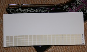
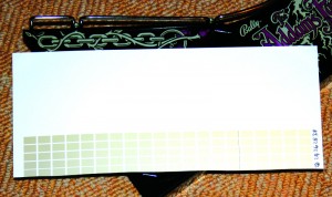
For white, I assumed that the white colour had been discoloured due to the black gloss paint under the screen print and due to a “yellowing” with age. So I printed out a grid of yellow versus black – and got some great colours of gold but nothing like the colour I was after. So I took a photo of the apron with white printer paper on it (yes, I used the printer paper with “golden” colour grid):
I then adjusted the levels of this photo to get a part of the white paper near to the “white” on the apron to have a white CMYK value (all 0%) and then measured the CMYK value of the apron “white” close to my “true white” spot:
The value I finished off with for the “white” was Cyan=40%; Magenta=20%; Yellow=35%; Black=0%.
Having printed this out, I still wasn’t happy with either colours so fine-tuned them:
I finished choosing the following colours:
Purple: Cyan=64%; Magenta=100%; Yellow=30%; Black=5%
White: Cyan=40%; Magenta=20%; Yellow=35%; Black=24%
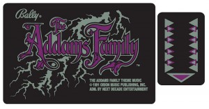
Which resulted in the following decals:
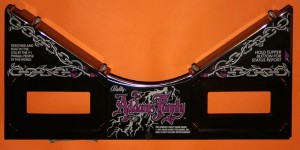
Now these may look strange, but I cut out The Addams Family logo from the paper and tried it out “in situ” on the actual apron (by simply placing it over the current logo):
Not bad! Although I will have to wait until I print the logo onto the waterslide decal paper to see whether I need any further adjustments.
